The city of Beverly Hills’ website is home to a treasure trove of information, but tracking down a particular fact across the site’s 3,000-plus pages can be a navigational challenge.
In order to improve the user experience, staff are undertaking a website redesign and met on Oct. 30 with members of the City Council Liaison Website Steering Committee to chart a path forward.
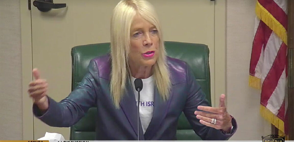
The committee is composed of Councilmembers John Mirisch and Lili Bosse who emphasized two key priorities during the meeting: ease of use and quality of design.
“If we see something that looks good, but it is difficult to navigate, we’re going to say ‘sorry,’ and if we see something that’s easy to navigate, but that doesn’t look good, we’re going to say ‘sorry,’” said Mirisch. “We’re putting a lot of effort into this and it needs to be done right.”
The committee also reviewed feedback from a community survey on the website redesign.
The survey highlighted several existing elements that residents enjoy and would like to see preserved. These include the user-friendly online services portal, the access to live meetings and the comprehensive event calendar.
The survey also pointed to aspects of the website that the community would like to see improved. These include a more mobile-friendly layout, the clearer organization of language, the addition of a robust search function, and more prominent placement of ongoing City Council and Commission initiatives. Lastly, respondents expressed a desire for a sleek and modern layout that captures the city’s historic charm.
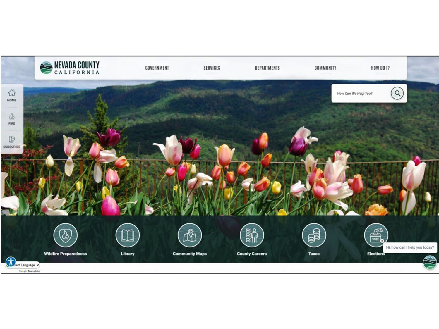
“What we want to do is make it simpler, but also make it comprehensive so you can find anything you want about the city; if it’s history, if it’s the library, if it’s ‘how do I pay my bill?’ If it’s how many police do we have? All of that should be there,” said Mirisch.
In an ideal world users should be able to find any information they are seeking within two clicks, said Bosse. Once the redesign is completed, she would like it to be tested on unfamiliar users to ensure it is truly user-friendly and easy to navigate.
“I really want us to wear the hat of somebody who is literally coming on to the website for the first time,” Bosse said.
Mirisch agreed with the “two-click” rule and also said it was important to make the search function as effective as possible.
“The search bar should be prominent, it should be intuitive,” he said. “One search should get you exactly what you want.”
Councilmembers and survey respondents also highlighted a desire to make the website more visually appealing and a dynamic representation of the city’s history and culture.
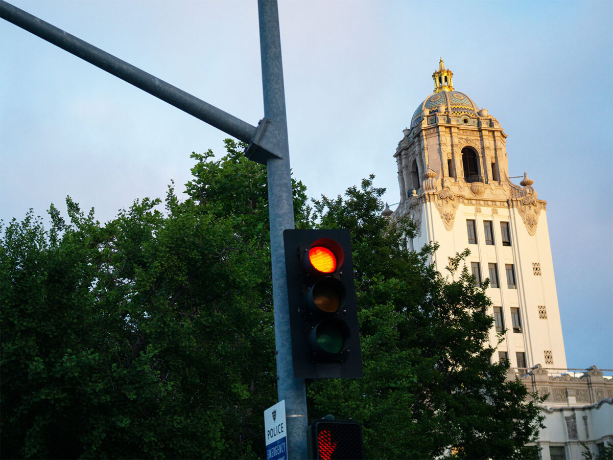
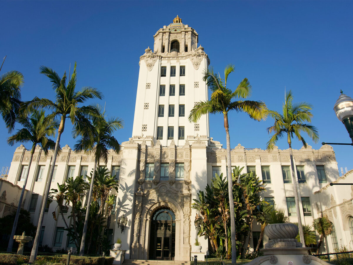
Mirisch said the city should make good use of its historic landmarks, stunning buildings and beautiful parks as website visuals. Bosse said the site should paint a thorough portrait of Beverly Hills’ history and help explain how the city’s past development informs its current goals and values.
Based on this feedback, staff will continue to work internally on the redesign and meet again with the committee in December to discuss a website mood board and potential layouts.
The goal is to finalize the design plan in December, migrate content onto the new site in January, train staff on the new website in March and release it to the public in April.


