A Beverly Hills resident by the name of Will Rogers once said, “All I know is what I read in the papers.”
These days, “what we know” is equally likely to come from computers, phones and TV as from the papers. The truth is, local newspapers no longer have the lock on the information game that they once did. As a result, their plight is increasingly anemic in cities across the country.
But Beverly Hills is no ordinary city. And the Beverly Hills Courier is no ordinary newspaper. It’s a legacy publication serving an iconic destination.
That’s why the new owners of the Courier decided that their first order of business (in addition to improving editorial content) was to revitalize its look. Today’s issue marks the debut of that new look. In the works for several months, the enhancements come from one of the country’s foremost designers. You’ll notice a number of changes, some obvious and some subtle.
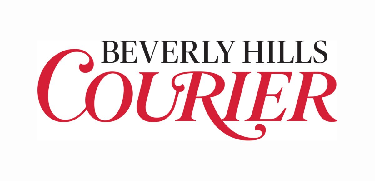
At the forefront of the Courier’s new brand experience is a re-drawn and refined logo. Choosing the right image to represent the publication was no easy task. After scrutinizing countless combinations, we’re convinced we made the right choice.
You’ll now find emblazoned on our masthead a much more distinguished “Beverly Hills Courier,” incorporating a warmer, more approachable red and sophisticated typeface.
In fact, all-new typography and typesetting offers increased readability on every page. Layouts are streamlined so as to enhance the reader’s experience. A more modernized workflow, with a clearer hierarchy and organization of content, is another hallmark of the new design.
As you peruse the Courier, you’ll find that each section is more clearly defined, with a corresponding new color palette. Visual cues in the form of color-coded dots are designed to help readers follow a story when it jumps to another page.
In the words of the late author (and one-time newspaper man) Jim Bishop, “A newspaper is lumber made malleable. It is ink made into words and pictures… I don’t see the world unless I see it in ink.”
Today, we present to you “ink made into words and pictures,” worthy of Beverly Hills. Our goal was to capture the spirit of everything that is great about this city. We’re confident in our choice.
We hope you agree.


